Moat
Brand Strategy
Naming
Logo
Typography
Copy
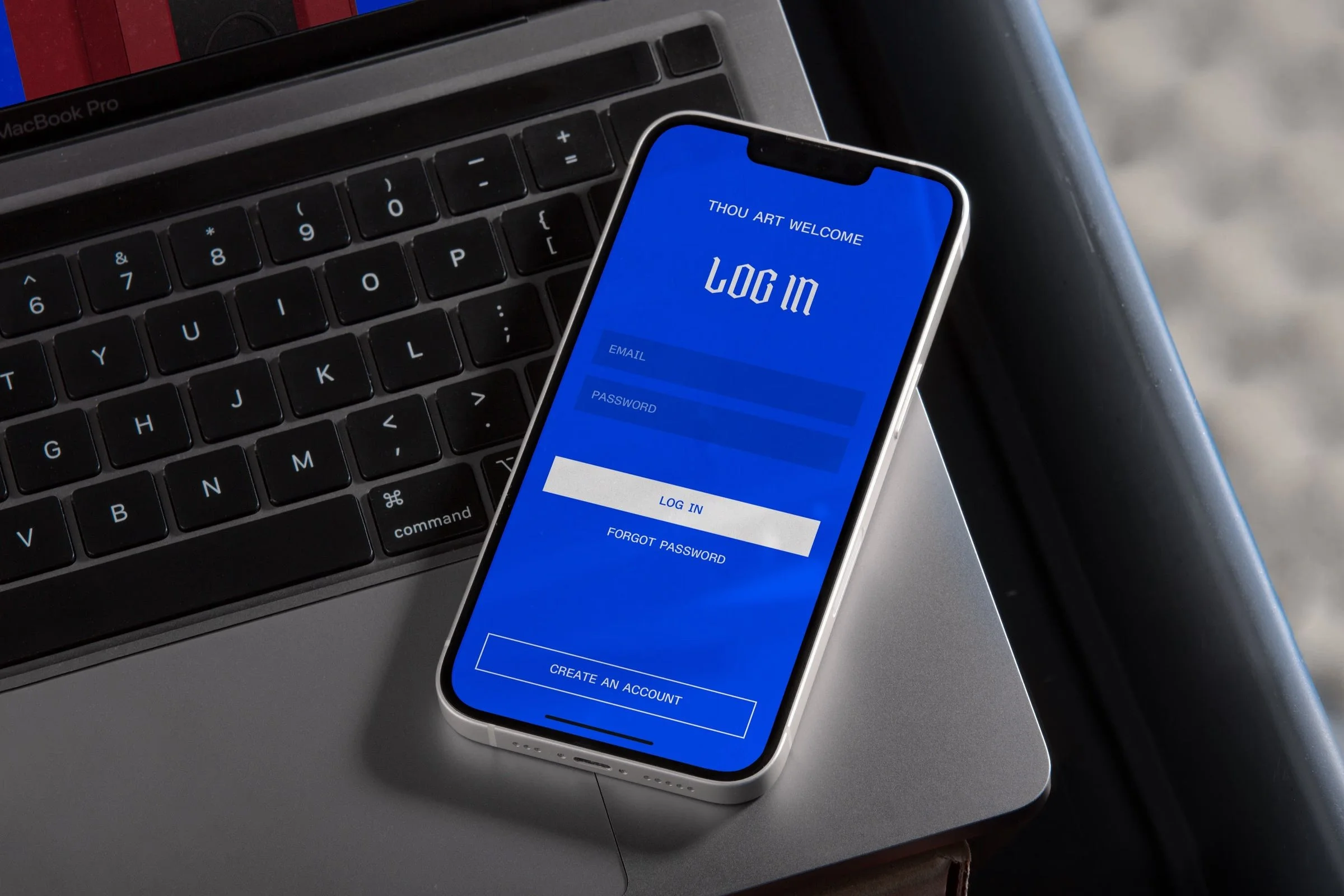
Color Palette
Website
-
Moat is a biometric smart lock company rethinking how people see everyday security. Positioned between medieval storytelling and modern technology, the brand needed more than a product name. It needed a moat around its business that communicated trust, strength, and imagination.
Challenge
The original concept, a fingerprint-activated gym locker lock, was part of a larger plan to enter both consumer and business security markets. But without a clear brand, visual system, or story, the products risked getting lost among other tech devices.
Solution
Inspired by fantasy, security symbolism, and bold brand examples like Liquid Death, the name Moat became the core idea. It expressed protection and identity, not just a product.
The work expanded into a complete brand system:
Simple, heraldic logo design
Color palette with an electric blue highlight for retail visibility
Packaging that emphasized texture and industrial quality
Messaging that connected medieval imagery with modern clarity
Strategy & Positioning
The Moat brand was built for two audiences:
Consumers: Emotional storytelling around “None Dare Cross the Moat” and protecting what matters most
Businesses: Scalable, data-ready systems focused on efficiency and control
This flexible positioning allowed the brand to reach gyms, schools, and large facilities while staying consistent and recognizable.
Brand Narrative & Tone
The tone of voice is strong, clear, and intelligent. Every message supports the idea of quiet power. A moat does not shout, but nothing gets past it.
Tone attributes:
Confident, not arrogant
Clever, not cute
Real, not abstract
Result
The final brand system was praised for its clarity and emotional impact, giving the company a lasting platform for growth.
Client: Confidential
Sector: Smart Security, Consumer Tech, B2B